Dodge Logo History
Over the last 100 years, Dodge had several intriguing logos that reflected the times when it used them. Depending on whether you’re looking at the grilles of a Dodge Ram truck, Durango SUV, or performance vehicle such as the Challenger, it could have a different logo for its exterior badging or other ornaments. Check out the team at Jeff Belzer Dodge Ram Lakeville’s rundown through the history of Dodge’s major logo changes, including how Dodge designed and used them.
Dodge Motors Logo History
It all started in 1900 when brothers John Francis and Horace Elgin Dodge started the Dodge Brothers Company. Before constructing its first vehicle in 1914, the company produced automobile parts, building its focus on quality. Chrysler acquired the Dodge Brothers Company after the brothers fell ill and passed away in 1920, and the business rebranded itself as Dodge. Let’s quickly move through the history of Dodge’s logo:
1910-1914: Early Days
Dodge created its original logo in 1910, and this was used throughout its founding years. It was only a company and automotive part logo and consisted of a stylized frame of bronze-colored metal with a D and B inside, which represented the two Dodge brothers.
1914-1938: Star Logo
Horace and John Dodge finished the construction of their first Dodge-brand car, the Model 30, with a small enamel badge bearing the revamped company logo: a circle with a six-pointed star in the center. An interlocked “DB” was at the center of the star, and the words “Dodge Brothers Motor Vehicles” circled along the outside edge.
The Dodge brothers weren’t Jewish, as the symbol represents two Greek deltas combined to create the impression of a star. Despite “Brothers” being eliminated from their produced vehicles by 1930, the DB star was still present up until the 1939 lineup.
1939-1955: Dodge Family Crest Logo
Around this time, the Dodge family crest appeared as the inspiration behind a new logo style. There was an “O” amid a vertical line interlocking with four horizontal bars. The logo originally had a knight’s head on top, which was removed in 1955. Dodge retired the logo from widespread use by 1957, but it eventually made a new appearance on the 1976 Dodge Aspen and persisted until 1981.
1955-1962: Forward Look
After the Dodge family crest, Virgil Exner created the “Forward Look” logo, with two overlapping boomerang shapes to represent speed and technological progress. The name of the design was taken from the redesign campaign being employed on Chrysler automobiles, inspired partly by the advancement of rocket propulsion technology.
1962-1981: Fratzog
The Dodge insignia had a vibrant label called a Fratzog from 1962 to 1981, consisting of a segmented deltoid of metal shapes in an aerospace-reminiscent theme. Funnily enough, if you were wondering where that name comes from, the answer is a random inspiration. As the story goes, the designer had not thought up a name, so they had to make one up on the spot.
1982-2010: Dodge Pentastar
After 1981, Dodge made use of the five-pointed Pentastar for almost ten years, highly similar to that used for Chrysler vehicles. One distinction was that the Pentastar for Dodge was generally red, while the one for Chrysler was blue.
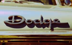
2010-Present
Dodge changed its logo when Ram Trucks debuted as a separate brand in 2009, with its own logo in 2010 using a combination of red and silver colors. The primary Dodge logo changed to a silvery font associated with the brand since almost the beginning. The current Dodge logo is simple, easily adaptable, and gives the impression of a storied American name in automobile history. The logo is paired with two red lines positioned diagonally at the top or right side.
Who Designed the Current Dodge Logo?
Dodge created its modern logo with the aid of the Wieden & Kennedy advertising agency, known best for the Nike swoop. Dodge intended to move away from Ram’s power-focused branding in favor of a “forever young” image emphasizing the brand’s performance cars. As a result, the designers drew inspiration from the Dodge Viper, which Chrysler’s Street and Racing Technology (SRT) division created.
The outcome was a plain text-based emblem with two diagonal, orange-red hash marks. Strongly reminiscent of styling for the Dodge SRT performance brand, the twin slanted cuts look somewhat like a finish line being passed, implying speed and track racing. The red font symbolizes daring and thrills, while the silver text stands for excellence, grandeur, and purity.
After the shield-with-crosshairs design of the 2011 lineup, Dodge’s new emblem started appearing as a badge on vehicle grilles for the 2012 model year, despite its original intention to restrict this design to digital and print marketing. One thing is clear: the emblem has been a smash hit, representing some of the fastest vehicles in history, such as the Challenger Demon and Charger SRT Hellcat Redeye.
Were Ram Hood Ornaments Used on Dodge Vehicles?
The Ram’s Head logo as it is today first emerged in 1993, and all vehicles started using it from 1996 onward, except for the Viper. However, the leaping ram first appeared as a hood decoration on Dodge trucks and cars as early as 1932.
It started to become more streamlined with the 1940 models, and by 1951 Dodge simplified it to just the Ram’s Head, complete with curling horns. From then, before its resurgence in the 1980s, the Ram’s Head was only used on 1954 model cars. The 1973 Dodge Bighorn heavy-duty tractor units also featured the old-school Ram’s Head hood ornament.
Buy or Lease a Dodge in Lakeville
The history of Dodge’s logo helps unveil its interesting relationship with the Chrysler brand, the popular Ram truck offshoot brand, and the general creative inspirations involved. If you’re ready to charge forward in a new Dodge, why not take a look through our selection at Jeff Belzer Dodge Ram? For new Dodge and Ram vehicles, Chrysler models, and even Wagoneer Jeeps, you’ll find the best range of options at our dealership in Lakeville, Minnesota.
Dodge by Steven Tyler PJs is licensed with CC BY-ND 2.0
0 comment(s) so far on Dodge Logo History